Hand lettering is drawing letters one at a time instead of writing them, and the whole craft comes down to one rule: thin on the way up, thick on the way down. To hand letter a quote for beginners, you pick a short quote, pencil a layout on smooth paper, build the letters from a handful of basic strokes, then ink over the top. Allow about 30 to 45 minutes for your first piece.
You do not need neat handwriting and you do not need to be able to draw. What you need is the patience to repeat the same stroke until it stops wobbling, which usually takes a few focused weeks rather than months.
This guide walks through the whole process, from choosing a quote you can actually finish to framing the result, and it includes the fixes for the mistakes almost every beginner makes on the way.
Table of Contents
- 1What You Need
- 2How to Hand Letter a Quote for Beginners: Step-by-Step
- 3How to hand letter a quote for beginners by practicing basic strokes
- 4Choose a quote that fits the space
- 5Sketch the quote and plan the layout
- 6Build consistent letterforms
- 7Add finishing details
- 8Quick fixes for common beginner errors
- 9Common Mistakes and How to Fix Them
- 10Frequently Asked Questions
- 11What pens are best for hand lettering beginners?
- 12Do I need a brush pen to hand letter a quote?
- 13What is the easiest lettering style for beginners?
- 14How do I keep the spacing between words even?
- 15How can I make hand lettering look more consistent?
- 16Start With One Word
What You Need
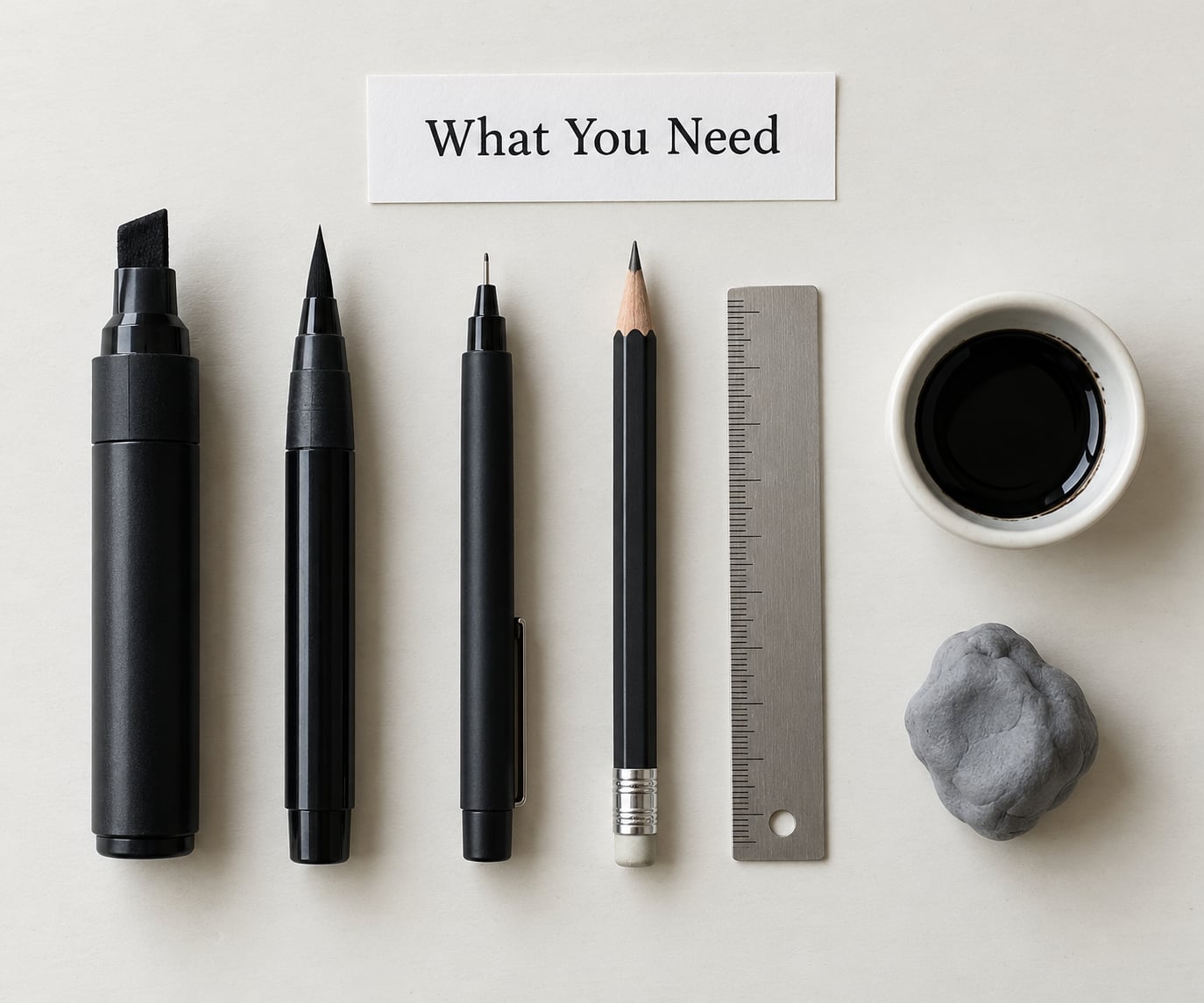
Start small. Buying a full kit on day one is the fastest way to spend money you are not ready to use, and the expensive tools will not rescue shaky strokes.
| Tool | What it is used for | Beginner verdict | Cost |
|---|---|---|---|
| Thick marker | Basic stroke practice, block letters | Best first pen | Low |
| Graphite pencil (2H or HB) | Sketching the layout and construction lines | Essential | Low |
| Kneaded or vinyl eraser | Lifting pencil guides and fixing ink mistakes | Essential | Low |
| Fineliner | Fine detail, faux calligraphy, finishing lines | Second purchase | Low |
| Brush pen | Pressure-based thick and thin strokes | Third purchase | Moderate |
| Ruler | Straight baselines and margin lines | Essential for layouts | Low |
| Smooth cartridge paper | Final lettering surface | Use for ink work | Low |
| Dot grid paper | Guiding letters onto a consistent rhythm | Helpful, not required | Low |
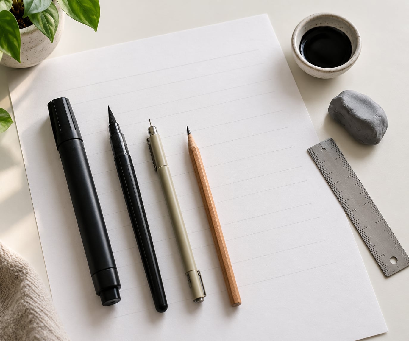
Your simplest starter setup is paper, a pencil, an eraser and one pen. Smooth cartridge paper beats notebook paper and printer paper, because rough surfaces drag the nib and make thick strokes look ragged. Lined paper fights you too, since its lines rarely match your x-height.
Skip tracing paper, light boxes and ink bottles for now. They are useful later for copying styles you admire, but nothing in the first ten pieces needs them.
How to Hand Letter a Quote for Beginners: Step-by-Step
Read the whole sequence once before you start. The order matters because each step depends on the one before it, and skipping ahead is what makes first attempts look crowded or wobbly.
- Practice the basic strokes
- Choose a quote that fits the space
- Sketch the quote and plan the layout
- Build consistent letterforms
- Ink the letters
- Add finishing details
- Dry, sign and display it
How to hand letter a quote for beginners by practicing basic strokes
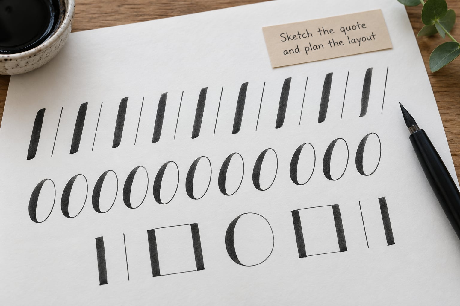
Every letterform in modern lettering comes from a small set of strokes, so this is where the real skill lives. Fill one page with each of the following before you attempt a single word.
Downstroke. Drag the pen straight down with firm, even pressure. This is the thick stroke that makes lettering look like lettering instead of writing. Practice pressure by making the line noticeably wider than a normal pen line.
Upstroke. Move the pen upward while releasing most of the pressure. This stroke should come out noticeably thinner than the downstroke, often close to a hairline.
Oval. Draw a tall narrow oval in one continuous motion, starting at the top, down the heavy side, around the bottom, and up the thin side. This builds a, c, d, g, o, p and q.
Undercurve and overturn. The undercurve is a shallow cup, the overturn is a shallow cap. These two shapes build most lowercase letters in combination, so they get more practice time than anything else on the page.
Compound curve. One stroke that curves in and out, used for m, n, h and k. Start these last.
With a brush pen, pressure does the work automatically. With a marker, you have to fake it by drawing a thin upstroke and a thick downstroke as two separate marks. That is completely fine and is how most beginners start.
Choose a quote that fits the space
Pick something short, four to eight words, with no word longer than about ten letters. Long words force you into cramped letterforms, and cramped letterforms are where beginners lose the baseline.
Skip quotes full of awkward letter pairs such as l-t, l-l, f-l or r-t, because each one requires a deliberate spacing fix that an eight-word beginner quote does not need yet.
Test the length against the page before committing. Three lines of four or five words each sits comfortably on letter paper, while two very long lines fight for every millimetre of width.
Sketch the quote and plan the layout
Now do the part almost everyone rushes. Lightly pencil the full quote on the finished paper, including every line break, before any ink goes down.
Draw a baseline with a ruler, then draw a second faint line above it for your x-height, which is the height of a lowercase letter. Those two lines are your entire alignment system, and every letter you draw should sit between them.
Mark your line spacing before you letter anything. Leave the gap between the baseline of one line and the top of the next noticeably wider than your x-height, otherwise the lines will blur into a grey block when you step back.
Decide your hierarchy now too. Either make the first line largest and taper down, or keep every line the same size and let the quote’s shape do the work. Both are legitimate; mixing three sizes on a beginner piece rarely is.
Keep pencil pressure light enough that guides disappear under an eraser. If you can see the lines through thin ink, go over them once more with a blending stump or the side of your hand.
Build consistent letterforms
Work letter by letter inside the penciled gaps rather than writing the word straight through. Draw the downstroke first, then the upstrokes, then join them, keeping the pen on the baseline every time you finish a letter.
Decide on one slant and hold it. A consistent five-degree slant is far more convincing than letters that drift between upright and leaning.
Test spacing as a fixed fraction of your x-height. Decide the gap between letters is one quarter of an x-height, the gap between words is two or three times that, and check every space against the same pencil mark.
Now trace over your pencil with ink using your basic strokes. Keep the ink version slightly wider than the pencil version so any leftover line hides underneath instead of showing beside it.
Add finishing details
Stop while the lettering is still readable and the page is still calm. The classic beginner mistake is decorating a piece that has not earned decoration yet.
Useful additions include a slightly thicker downstroke on key words, a hand-drawn underline swash, small dots or asterisks to fill an awkward corner, and a drop shadow offset by two or three millimetres.
Use colour with restraint. One pen colour plus one accent is plenty; a second accent colour works if it is genuinely darker or lighter than the first.
If you want a shaded effect, draw a thin line parallel to each downstroke and fill between it and the letter with closely spaced diagonal pen strokes. Keep the shading the same width on every letter or the word will look mottled.
Quick fixes for common beginner errors
Catch these during the drawing process, not after. Fixing a wobble takes one stroke, while fixing it in ink takes a scrap of paper and a fresh start.
Shaky downstrokes. Slow down and rest the side of your hand on the page for stability. Speed is the cause far more often than pressure.
Flat or drifting baseline. Your guide is probably too faint to see. Redraw the baseline in slightly darker pencil and check your letters against it before every third letter.
Uneven x-height. Compare each lowercase letter against the upper guideline rather than by eye. The letters that look too big are usually the ones you drew first.
Heavy pressure. You are pressing to make the line thick instead of relaxing to make it thin. Practise the same stroke with the lightest touch you can manage, then add weight gradually.
Overcomplicated scripts. Switch to print block letters for a whole practice sheet. Style complexity is the least valuable thing to fight while you are learning pressure control.
Common Mistakes and How to Fix Them
Almost every wobbly beginner quote comes from the same handful of problems, and each one has a straightforward correction.
- Letters that change size word to word. Pick a single x-height and mark it once at the top of the page, then hold every lowercase letter to it.
- Crowded spacing. Space words two or three times wider than your letter gaps. Even spacing reads as confident even when the letters themselves are imperfect.
- Skipping the thick downstroke. If every line is the same width, the piece looks like neat handwriting rather than lettering. Go back over each downstroke with the thicker pen.
- Uneven baseline. Rest your hand on the page and slow the pen’s travel speed. Check against the pencil line after every letter rather than at the end.
- Changing style halfway through. Finish the piece using one alphabet. Mixing a block opening with a script ending is a common reason finished quotes feel unsettled.
- Decorative overload. Remove the last flourish you added, then step back. If the quote is still instantly readable, that flourish earned nothing.
- Retrying a ruined word. Letters accumulate pressure and smudging after the second or third attempt. Start the line again on fresh paper instead.
Practice fifteen minutes a day rather than two hours twice a week. Short daily sessions build the muscle memory in your hand, and they let you compare this week to last week, which is the fastest feedback loop you have.
Keep your early work in a folder instead of binning it. Comparing attempt one with attempt twenty tells you more than any before-and-after post ever will.
Choose a lettering style that suits your natural handwriting. If your everyday writing leans heavily to the side, a slanted style costs you less effort than fighting against it with upright block letters.
If you want to letter someone else’s words, attribute them on the piece. Put the author beneath the quote in small print or plain block capitals, and check the wording against the original source before you ink it.
Frequently Asked Questions
What pens are best for hand lettering beginners?
A thick marker such as a Crayola Supertip is the best starting tool because it costs little, dries quickly and gives you an unmistakable thick downstroke. Add a black fineliner next for detail work and faux calligraphy. A brush pen is worth buying once your strokes are steady, because pressure control is much easier to learn once you are not also fixing letter shapes.
Do I need a brush pen to hand letter a quote?
No. A thick marker, a pencil and an eraser will get you through a complete quote. Faux calligraphy does the same job with no pressure control: write the words in your normal handwriting with a fineliner, then go back over every downward stroke with a thicker pen to imitate the weight you cannot make yet. Most first pieces are built this way.
What is the easiest lettering style for beginners?
Print block letters are the easiest starting style because each letter is built from straight lines, a few ovals and one or two undercurves. Script lettering is a good second step once your strokes stop wobbling. Bounce lettering and blackletter look impressive but demand far more letter construction, so leave them until the plain alphabet feels routine.
How do I keep the spacing between words even?
Pencil the entire quote first, then place letters one at a time inside each gap instead of letting your hand drift across the line. Measure spacing as a fraction of your x-height, the height of a lowercase letter, and check every gap against the same pencil mark. Constant spacing looks deliberate and polished even when the individual letters are not.
How can I make hand lettering look more consistent?
Consistency comes down to two measurements: x-height and baseline. Keep one light guideline across the page and hold every lowercase letter to the same height against it, then draw each letter resting on the same baseline. Practise fifteen minutes daily rather than in long occasional sessions, and keep your early work so you can see the change over time.
Start With One Word
Pick a single short word, such as a name or a four-letter word with one ascender, and letter it fifty times on one page. That page teaches you downstrokes, upstrokes, ovals, baseline control and spacing in a way no tutorial can shortcut.
Then take one short quote, four to eight words, and finish it end to end in one sitting. Not one to admire, just one to complete. How to hand letter a quote for beginners is a skill that only moves when whole pieces get finished and put on a wall.
Let the ink dry fully before you frame it, and sign and date the bottom corner in small print. Then hang it somewhere you pass every day and start the next piece.