For most quote posters, set the quote text between 60 and 120 pt on an 18×24-inch print, and between 90 and 180 pt on a 24×36. The real rule underneath those numbers is simple: roughly one inch of letter height for every ten feet of viewing distance, and 72 pt equals one inch in print. Pick a size, hang a test print, and check it from where people will actually stand.
It takes about fifteen minutes to get right and about four hours to undo. Most of the guessing happens because designers choose a point size first and then find text that fits around it, which is backwards.
This guide walks through the whole method: how to size the main line, how to drop the attribution down without losing it, and how to test a layout before you spend money printing twenty of them.
Table of Contents
- 1What You Need
- 2Step-by-Step: Choose a Readable Quote Poster Size
- 3Set the Main Quote for the Longest Line
- 4What Font Size Works Best for a Quote Poster?
- 5Make the Attribution Smaller but Still Legible
- 6Check the Layout at Full Poster Scale
- 7Test Contrast and Distinguish Key Words
- 8Common Mistakes
- 9Frequently Asked Questions
- 10What is the best font size for a standard 18 × 24-inch quote poster?
- 11How large should text be on a quote poster viewed from across a room?
- 12What size should the author name be compared with the quote?
- 13How do I fit a long quote on a portrait poster without making it too small?
- 14What font size should I use for a 12 × 12-inch quote poster?
- 15Do point sizes match when the same design is exported for different poster sizes?
- 16Conclusion
What You Need
Before you type a single character, pin down these five things. Each one changes the answer, and getting them in order saves a lot of backtracking.
Poster dimensions. The exact width by height in inches, not an aspect ratio. An 18×24 and a 24×36 are both 2:3, and the same point size that works on one will be invisible on the other.
Viewing distance. How far away will the first person stand? Three feet for a desk print, six feet for something above a sofa, ten feet or more for a hallway or office wall. Guess wrong in either direction and the sizing rule cannot save you.
The finished quote and attribution. Lock the exact words before you size anything, punctuation included. Long attributions like “Marcus Aurelius, Meditations, Book V” change the layout more than most people expect.
A design tool. Canva, Adobe Express, Photoshop, Inkscape, or even Google Slides. What matters is whether it works in points and can export a print-resolution PDF.
A typeface, or a shortlist. Deciding this early means you can judge real width and height rather than guessing from a font menu. Two families is plenty, and a single family in two weights is often better.
Step-by-Step: Choose a Readable Quote Poster Size
The order matters: longest line first, then numbers, then attribution, then testing. Work through the five steps below in sequence and the sizing resolves itself.
Set the Main Quote for the Longest Line
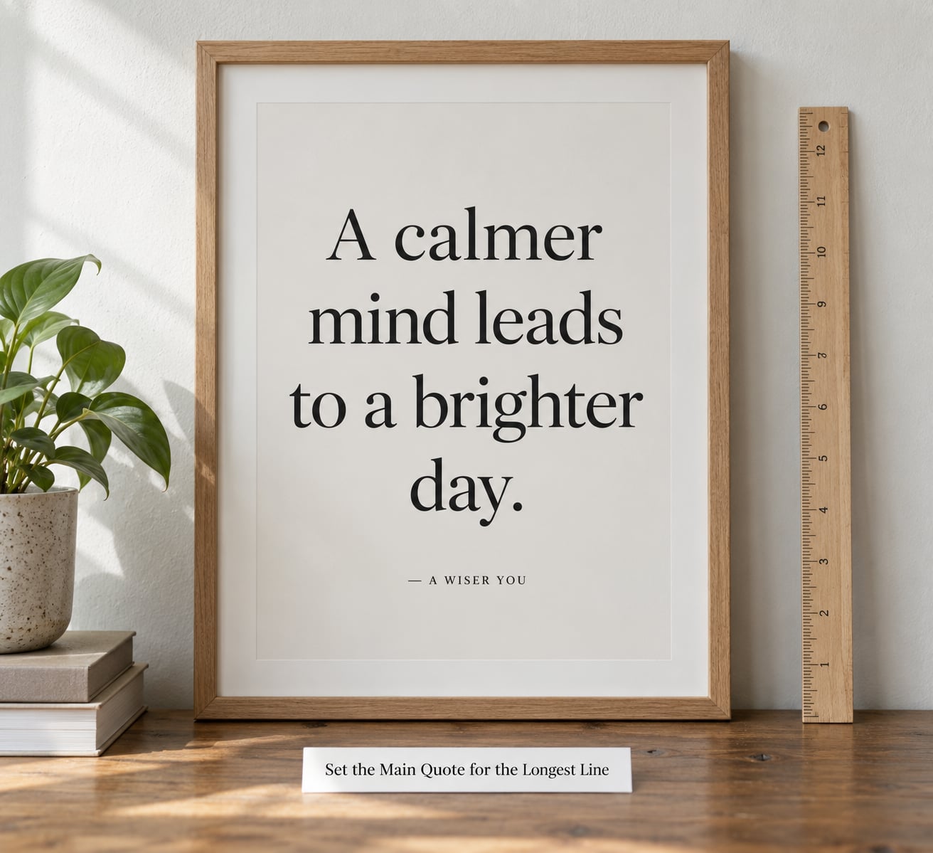
The longest single line of your quote sets your maximum point size, because that is the line that has to fit inside the printable width. Find it by typing the whole quote, letting it wrap naturally, and measuring the widest line. If that line cannot fit the width at a size large enough to read, you have three choices: shrink the type, rebreak the lines, or cut words from the quote.
Shape changes what fits. A portrait 18×24 gives you a tall narrow column, so long lines break early and you can push the point size higher. A landscape 18×24 gives you a wide short block, so text has to break more often and the size usually drops. A square 12×12 sits between the two, and a four-line quote on a portrait print behaves very differently from the same quote on a square.
A useful sanity check: leave outer margins of roughly 10 to 15 percent of the poster width on each side. If the quote is touching or nearly touching the trim edge at any size, it is too big, no matter how good it looks on screen.
What Font Size Works Best for a Quote Poster?
These ranges assume normal viewing distance, a condensed or average-width typeface, and dark text on a light background. The three quote columns matter more than the poster size: a nine-word quote and a twenty-five-word quote on the same 18×24 cannot share a point size.
| Poster size | Short quote (1-9 words) | Medium quote (10-18 words) | Long quote (19-30 words) | Attribution |
|---|---|---|---|---|
| 8×10 in | 48-72 pt | 36-48 pt | 28-36 pt | 14-20 pt |
| 11×17 in | 72-96 pt | 54-72 pt | 40-54 pt | 18-26 pt |
| 16×20 in | 90-120 pt | 66-90 pt | 50-66 pt | 22-30 pt |
| 18×24 in | 108-144 pt | 78-108 pt | 60-78 pt | 24-36 pt |
| 24×36 in | 144-216 pt | 108-144 pt | 80-108 pt | 32-44 pt |
| A2 (16.5×23.4 in) | 96-140 pt | 72-96 pt | 54-72 pt | 22-30 pt |
| A1 (23.4×33.1 in) | 144-200 pt | 108-144 pt | 80-108 pt | 32-42 pt |
Now adjust for quote length inside each column. A four-word quote can sit at the top of its range; a nine-word quote usually belongs at the bottom.
| Quote length | How to treat it on an 18×24 | Typical line count |
|---|---|---|
| 1-4 words | 130-170 pt, treat the words as a headline | 1-3 lines |
| 5-9 words | 100-135 pt | 3-5 lines |
| 10-18 words | 75-105 pt | 4-7 lines |
| 19-30 words | 55-75 pt | 6-10 lines |
| 30+ words | 40-55 pt, or cut the quote | 9+ lines |
If you design in pixels instead of points, convert rather than guess. One inch is 72 pt at any print size, and 96 px at standard screen resolution, so multiply points by 1.333 to get pixels.
| Points (print) | Pixels at 96 dpi (screen) | Approximate cap height |
|---|---|---|
| 24 pt | 32 px | 0.24 in |
| 36 pt | 48 px | 0.36 in |
| 60 pt | 80 px | 0.60 in |
| 72 pt | 96 px | 0.72 in |
| 120 pt | 160 px | 1.20 in |
| 180 pt | 240 px | 1.80 in |
Two adjustments matter more than the numbers. Viewing distance beats size: a quote read from ten feet needs roughly twice the letter height of the same quote read from five feet. And typeface width changes everything, because a condensed face fits maybe 20 percent more per line than a wide serif at the same point size, which often means you can go up rather than reflow.
Make the Attribution Smaller but Still Legible
Set the author, source, or date at roughly 30 to 40 percent of the quote’s point size, then add a little extra letter spacing. A 100 pt quote usually pairs with a 30 to 40 pt attribution; a 60 pt quote pairs with 18 to 24 pt.
Uppercase is the most common choice for the attribution because it separates it from the quote without adding another font, but only for the name and source. Running a long title in all caps at a small size hurts legibility, since capitals carry less distinct shape information than lowercase.
The failure mode here is going too small. If the attribution is under about 20 pt on an 18×24, most people will not read it from standing distance, and an unreadable attribution looks worse than no attribution at all. When in doubt, cut the source line down to the author’s name and let the year go.
For placement, give the attribution its own line with roughly half a line of extra space above it. Align it to the same left edge as the quote, or center both together, but do not mix a centered quote with a left-aligned attribution.
Check the Layout at Full Poster Scale
Designers judge readability at 100 percent zoom on a laptop, and a poster that reads perfectly there can be unreadable at three feet. The fix is to test the layout at the size it will be seen.
Work through this check. Print or export a full-size proof and look at it from arm’s length, then step back to six feet and read it out loud in under three seconds. If you cannot get through the quote at six feet, add roughly 20 percent to the point size. Then check the longest line for crowding: if any two words nearly touch or the block runs past the margins, reflow the line breaks before you touch the size.
Three fixes, in the order I would try them. Reflow the line breaks first, since moving a word from a crowded line often buys you a whole point size. Then reduce word count, which almost always improves the design. Only then drop the point size, because shrinking is the fix that damages the piece most often.
Test Contrast and Distinguish Key Words
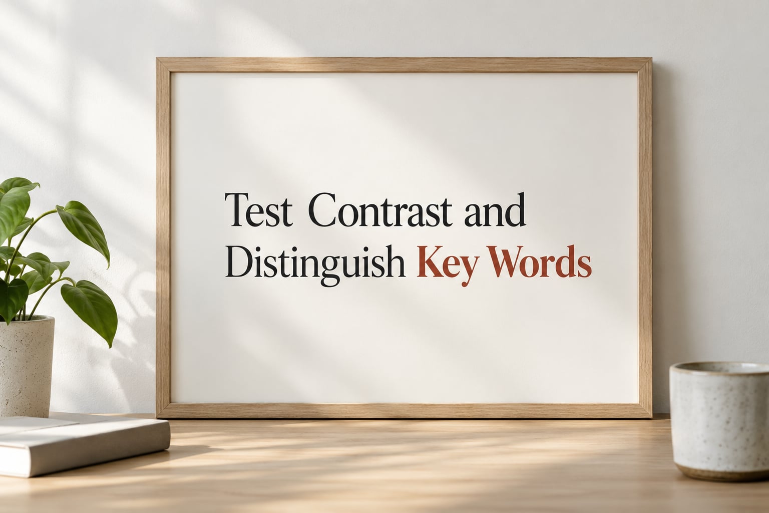
Contrast comes before size. Dark ink on a light ground reads faster than light ink on a dark ground at the same point size, because the letter shapes are defined rather than glowing. If your design is reversed out of a dark background, bump the size about 10 percent and lighten the type weight so the counters of letters like a and e do not fill in.
After that, pick one phrase to emphasise, not five. A single key phrase in a contrasting weight or an italic serif creates a focal point and gives the eye somewhere to land. Using caps, bold, italic and colour on four different lines is not emphasis, it is noise, and viewers end up reading nothing in particular.
One more check on spacing. Set your line spacing to roughly 1.1 to 1.3 times the point size for display type at poster scale, and add tracking to small attribution text. Keep line length between about 45 and 75 characters, and where a line falls short, indent it slightly rather than stretching the letters apart.
Common Mistakes
Nearly every unreadable quote poster I have seen makes at least one of these seven mistakes.
Choosing the point size first. The layout should drive the size, not the other way around. Set the quote as large as the longest line and the margins allow.
Using one size for every line. The quote and the attribution need to be different sizes, and a secondary line or a date needs to be different again. A type scale of two or three steps is plenty.
Shrinking the attribution too far. Below about 20 pt on an 18×24 it stops being readable at standing distance. Shorten the source instead of shrinking the type.
Overcrowding the page. If the text block fills most of the printable area, the poster feels loud. Leaving 30 to 40 percent of the printable area as negative space does more for the design than any font choice.
Ignoring typeface width. Two fonts at the same point size can occupy very different amounts of space. Judge the actual longest line, not the number in the size box.
Judging readability on screen only. A laptop preview flatters small type. Test at full scale or print a proof before committing.
Using more than two or three fonts. Beginner design courses teach one heading font and one body font, and that limit holds for posters too. More fonts do not add meaning at this scale.
One habit worth stealing: set a word budget before you design. An 18×24 handles about 8 to 12 words comfortably, an 11×17 about 5 to 8, and a 12×12 about 4 to 6. If the quote you love runs thirty words, trimming it to twelve will do more for the poster than any amount of resizing.
Frequently Asked Questions
What is the best font size for a standard 18 × 24-inch quote poster?
For an 18×24-inch quote poster, set a short quote (1-9 words) at 108-144 pt, a medium quote (10-18 words) at 78-108 pt, and a long quote (19-30 words) at 60-78 pt. Set the attribution at 24-36 pt. If your poster will be read from more than eight feet away, add 20-30 percent to those numbers and cut words from the quote to compensate.
How large should text be on a quote poster viewed from across a room?
Use one inch of letter height for every ten feet of viewing distance as your starting point, which works out to roughly 72 pt of letter height at ten feet. Print shops often put cap height rather than point size in the box, so divide by two to get the point size you actually type. For an eight-foot room, that is around 58-60 pt of actual type height.
What size should the author name be compared with the quote?
Set the attribution at roughly 30 to 40 percent of the quote’s point size, so a 100 pt quote gets a 30-40 pt author line. Add a little letter spacing and use uppercase for the name and source. Below about 20 pt on an 18×24 poster, most viewers cannot read it from standing distance, so shorten the source line rather than shrinking the type further.
How do I fit a long quote on a portrait poster without making it too small?
Reflow the line breaks first, because moving two or three words can free up a whole point size. If that is not enough, trim the quote to fit a word budget of roughly 8 to 12 words on an 18×24 portrait print. Keep line length between 45 and 75 characters and set line spacing to 1.1 to 1.3 times the point size so the block stays open and readable.
What font size should I use for a 12 × 12-inch quote poster?
On a 12×12-inch print, a short quote of 1-4 words works at roughly 72-96 pt, and a medium quote of 5-9 words at about 54-72 pt. Set the attribution at 18-24 pt. Square formats leave less usable width than their size suggests, so budget for four to six words and check that the longest line keeps clear of the margins.
Do point sizes match when the same design is exported for different poster sizes?
A point size means the same physical height on every poster size, so a 72 pt line that looks balanced on an 8×10 print will look small on a 24×36. Either scale the type up as the poster grows, or design a separate version for each size using the poster-size table as your starting point. Only the relationship between quote, attribution, and margins carries over unchanged.
Conclusion
Start with the longest line of your quote and the distance it will be read from, not with a number you liked in a template. Set that line as large as the margins allow, drop the attribution to about a third of it, and then test the full-size layout from six feet away before exporting. That test takes ten seconds and it is the difference between a poster people read and one they walk past.