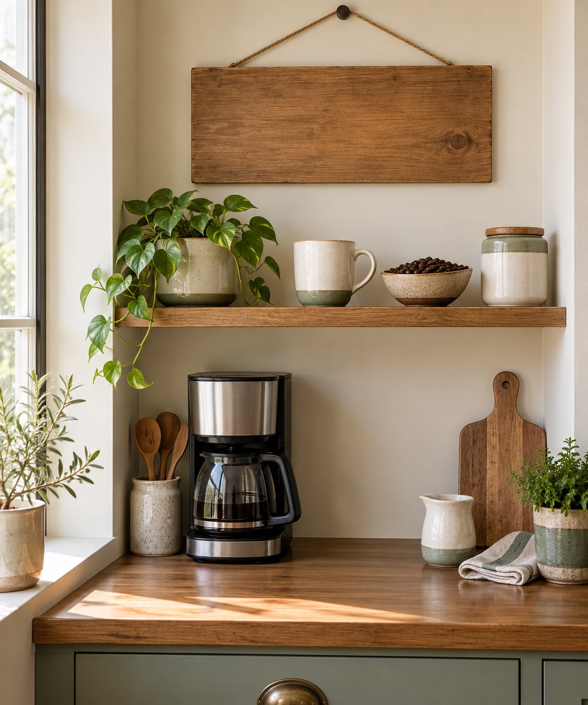
A coffee quote for a kitchen sign is a short line of text you hang on the wall so the words themselves become the decor. The ten below are ready to copy: “Coffee is a hug in a mug,” “But First, Coffee,” “Life begins after coffee,” and seven more, each with its word count, the panel size it actually fits, and the corner of the kitchen it suits best.
Most people pick the wrong quote first and the sign second, then discover the line they loved needs a 24-inch canvas that swallows a whole cabinet run. So read the table, measure your wall, and pick the saying after. Ten minutes of measuring saves a return trip.
Table of Contents
- 1Quotes About Coffee for a Kitchen Sign at a Glance
- 21. “Coffee Is a Hug in a Mug”
- 32. “But First, Coffee”
- 43. “A Cup of Coffee and a Book Is All I Need”
- 54. “Life Begins After Coffee”
- 65. “I Like My Coffee How I Like My Mornings: Strong and Steady”
- 76. “Coffee: Because Adulting Is Hard”
- 87. “The Best Conversations Happen Over Coffee”
- 98. “There Is Nothing Better Than a Good Cup of Coffee”
- 109. “Caffeinated and Ready to Face the Day”
- 1110. “May Your Coffee Be Strong and Your Monday Be Short”
- 12How to Choose the Right Coffee Quote for Your Kitchen
- 13Match the word count to the panel
- 14Match the tone to the decor style
- 15Match the finish to the room
- 16Family-safe and adult-humor lines, sorted
- 17Where to put it
- 18Frequently Asked Questions
- 19What size coffee quote sign is best for a kitchen?
- 20Where should I hang a coffee quote in my kitchen?
- 21Which coffee quote fits a minimalist kitchen?
- 22Should a coffee kitchen sign include punctuation?
- 23How can I make a coffee quote sign match my existing decor?
- 24Conclusion
Quotes About Coffee for a Kitchen Sign at a Glance
| Quote | Words | Best sign size | Best kitchen spot | Tone |
|---|---|---|---|---|
| Coffee is a hug in a mug | 6 | 7×7 to 9×12 | Above the coffee maker | Cozy |
| But First, Coffee | 3 | 3.5×10 shelf plaque | Kitchen doorway or coffee station | Playful |
| A cup of coffee and a book is all I need | 10 | 9×12 or larger | Nook table or breakfast corner | Calm |
| Life begins after coffee | 4 | 3.5×10 or 7×7 | Over the cabinet run | Energetic |
| I like my coffee how I like my mornings: strong and steady | 12 | 12×12 or 12×16 | Dedicated coffee bar wall | Practical |
| Coffee: because adulting is hard | 4 | 7×7 or 9×12 | By the kettle or sink | Funny |
| The best conversations happen over coffee | 6 | 7×7 to 9×12 | Dining area or open-plan wall | Welcoming |
| There is nothing better than a good cup of coffee | 10 | 9×12 or larger | Neutral wall opposite a window | Timeless |
| Caffeinated and ready to face the day | 7 | 7×18 or 9×12 | Coffee station or pantry door | Motivational |
| May your coffee be strong and your Monday be short | 10 | 9×12 or 12×16 | Breakfast area or home office | Giftable humor |
1. “Coffee Is a Hug in a Mug”
Six words, all of them soft. This is the line to buy when the kitchen is a place you stand in a lot rather than one you pass through on the way out.
It reads well in a thin serif or a rounded sans, and it does not fight a busy backsplash because it has no hard consonants stacked up. I like it in warm gray on a light wood panel above the coffee maker, where the sign sits at eye level and you read it while the machine brews.
Skip the farmhouse grain if your cabinets are already warm toned, or the sign disappears into them. On cool white or pale gray walls, the same line in charcoal black suddenly reads as the whole focal point.
2. “But First, Coffee”
Three words is the shortest useful quote on this list, and it is the one people actually see most often in real kitchens. It has been on signs, mugs, aprons, and stickers for years.
Because it is so short, it can live almost anywhere: a narrow shelf plaque, a small hook rail near the doorway, or the front of a coffee station cabinet. Nothing competes with it.
One caution. This line is everywhere, so if you are ordering a sign and want something nobody else in your book club has, keep scrolling. If you want the one line that reads clearly from across a galley kitchen, stop here.
3. “A Cup of Coffee and a Book Is All I Need”
Ten words makes this a long line for a kitchen sign, which means the panel decides whether it works. On a 7×7 panel the words get squeezed and the calm feeling disappears into a block of type.
Put it on a 9×12 or larger, and only where there is quiet around it: a nook table, a breakfast corner with a reading chair, or a wall next to a small bookshelf. The line is an invitation to slow down, and it reads wrong in a hallway.
For style, this one takes a thin modern serif in matte black. A casual handwritten font makes it look like a gift-shop magnet; a crisp serif makes it look like it was chosen.
4. “Life Begins After Coffee”
Four words, and the punchline lands on the word “after.” That single word does the work, which makes this a good pick for a kitchen where the sign has to be read in half a second.
Pair it with a bright white background and black lettering, then give it enough empty margin to breathe. Signs with tight edges to text look busy even when the text is short.
It suits a household that runs fast: two mugs in the dishwasher, a homework backpack by the door, a calendar covered in appointments. In a very formal, marble-and-brass kitchen it would feel like a joke nobody asked for.
5. “I Like My Coffee How I Like My Mornings: Strong and Steady”
Twelve words is the longest line here, and it is the only one that genuinely needs a large panel. Squeeze it onto a small sign and the punchline disappears into a paragraph.
Give it 12×12 at minimum, ideally 12×16, hung on a wall with open space around it. The best home for this line is a dedicated coffee bar wall or a wide empty stretch above a sideboard, where the eye can travel across the whole sentence at once.
The reason to like this quote is that it states a preference instead of a mood. It suits someone who has a fixed routine and does not need a sign to be cute. Skip it in a rental or a first apartment, since it commits a lot of wall to a long read.
6. “Coffee: Because Adulting Is Hard”
Four words and a colon. The colon is doing the comedic timing, so keep it. Remove the punctuation and the line becomes a complaint instead of a joke.
This is the one to pick for modern farmhouse, eclectic, or relaxed contemporary rooms, especially any kitchen where the family jokes with each other first and worries later. It also works in a home office nook, since the sentence quietly covers paperwork, laundry, and taxes.
I have seen it fail in kitchens styled around soft neutrals and ceramics, where a self-deprecating line reads as clutter. If your shelves hold three handmade bowls and a linen runner, choose something calmer.
7. “The Best Conversations Happen Over Coffee”
Six words, and it makes a claim about the room itself rather than about the drink. That shifts how people use the kitchen, which is worth thinking about before you drill a hole.
It fits open-plan homes, dining areas, and coffee stations where people actually sit down. In a closed-off galley kitchen with a single window, it is a promise the room cannot keep.
Warm colors suit it: terracotta, ochre, rust, or a wood frame. On a plain white wall, a single warm-toned frame is enough to keep the sign from looking like a notice taped to the fridge.
8. “There Is Nothing Better Than a Good Cup of Coffee”
Ten words, plainspoken, no joke and no pep talk. This is the quiet option, and quiet is hard to find on a sign shelf because most of what is for sale wants to be noticed.
It works in a traditional, minimalist, or neutral kitchen where the walls are white, cream, or pale gray and the cabinets are flat-front. Hang it on the wall opposite a window rather than above the counter, so daylight keeps the words readable all day.
A clean, centered layout matters more here than in any other option. One line, generous margins, one typeface. If you want the sign to disappear politely into the room while still saying something true, this is the quote.
9. “Caffeinated and Ready to Face the Day”
Seven words and an alliteration that helps. The rhythm makes it read aloud nicely, which matters if you have ever said it out loud while filling the kettle.
Place it near the main coffee station or on the pantry door, where someone standing at the fridge gets a small push instead of a chore list. A 7×18 horizontal panel suits the sentence’s shape better than a square.
It is a good fit for a kitchen that needs a little lift: a first apartment, a family kitchen full of school mornings, a home office that doubles as the coffee spot. It is less useful in a house where everyone is already loud and cheerful by seven.
10. “May Your Coffee Be Strong and Your Monday Be Short”
Ten words, and the last four are the punchline. This is the most giftable line on the list, because it works for a housewarming, a coworker, a teacher, or a hostess without knowing much about the recipient.
Size it at 9×12 or larger so the last words do not shrink. A two-line layout with the coffee half on top and the Monday half below keeps the joke from getting lost in one long row of small type.
For a breakfast area or a home office, it does double duty as decor and as a small Monday pep talk. If you are giving it as a gift, add the year on the back rather than the front, so the sign itself stays clean.
How to Choose the Right Coffee Quote for Your Kitchen
Match the word count to the panel
This is the constraint that decides everything, and it is the one most sign listings never explain. A panel has a fixed width, and words fill it. Three words on a 3.5×10 shelf plaque can be large enough to read from the doorway; the same three words on a 12×12 sign look lost.
As a working rule: three to five words suits a narrow shelf plaque or a hook rail, six to nine words fits a 7×7 or 9×12 panel, and ten words or more wants 9×12 all the way up to 12×16. If you are typing your own sign, set the words, look at the block, and resize the panel rather than shrinking the type.
Match the tone to the decor style
A farmhouse kitchen with shiplap, wire baskets, and a chalkboard calendar takes a joke well. A minimalist kitchen with flat white cabinets and one long shelf takes almost anything quietly, but puns cheapen it fast. A boho or eclectic room with layered textiles and plants can carry a warm line that would feel loud elsewhere.
Concretely: in a farmhouse kitchen, “Coffee: because adulting is hard” in a distressed finish feels native. The same words in a hand-lettered sans on a plain white panel would feel like a gift shop. In a minimalist kitchen, “There is nothing better than a good cup of coffee” in a thin serif, centered, does the job without competing.
Match the finish to the room
Color is where most sign choices go wrong. Pull one color you already own out of the room and repeat it. Warm wood tones, cream, and one muted green cover most kitchens; a bright color needs two matching objects nearby to look deliberate rather than accidental.
Text color should contrast with the panel, not with the wall. Black on white, cream on black, charcoal on natural wood all read cleanly. Light gray on white is the one combination that disappears under evening light, and evening is when most people are standing in their kitchen.
Family-safe and adult-humor lines, sorted
Every sign seller mixes clean and adult lines in the same grid, so it is worth filtering before you order. Everything in quotes 1 through 10 above is family-safe and reads fine with guests, in-laws, or a real estate photographer.
If you want wordplay, the puns that do best on a sign are short and billboard-length, which is exactly what people gravitate to when they post sign photos. Five worth trying: “Coffee spelled backward is eeffoc,” “Espresso Yourself,” “Wanna hear a joke? Decaf,” “No Coffee No Workee,” and “Better Latte Than Never.” All five are unsigned lines that circulate online, so print them without a name attached.
Where to put it
Above the coffee maker is the obvious answer and usually the right one, because the sign and the object it describes end up in the same glance. Measure the cabinet run first and subtract the width of the upper cabinets, since that gap is the only usable wall.
Second choice is the wall you see when you walk in, usually opposite or beside the doorway. Third is a small breakfast area or nook, where a longer quote has room. The worst spot is directly over the sink, where steam and splashes do not belong.
Frequently Asked Questions
What size coffee quote sign is best for a kitchen?
Most kitchens have room for a 7×7 or 9×12 sign, which handles six to nine word quotes at a readable size. Narrow shelf plaques around 3.5×10 inches suit three to five words and can be hung near a doorway. Anything ten words or longer wants 9×12 at minimum, and long lines above twelve words need 12×12 or 12×16. Measure the wall gap between your upper cabinets before choosing.
Where should I hang a coffee quote in my kitchen?
Above the coffee maker is the strongest spot, because the sign and the appliance it describes land in the same glance. The wall you see when you walk in is the second best choice, usually opposite or beside the doorway. A breakfast nook works for longer quotes that need empty space around them. Avoid hanging anything directly over the sink, where steam and water hit the panel daily.
Which coffee quote fits a minimalist kitchen?
Short, plainspoken lines work best, because a joke or a pun adds visual noise to a room built on flat cabinets and clean counters. There is nothing better than a good cup of coffee in a thin serif, centered with wide margins, is the safest pick. But First, Coffee also stays quiet if you set it in one small typeface with plenty of white space around it. Skip anything with a colon and a punchline.
Should a coffee kitchen sign include punctuation?
Keep punctuation when it carries meaning. Coffee: because adulting is hard depends on the colon for its timing, and a longer sentence with two clauses needs a comma or a semicolon to read cleanly. Leave off apostrophes and underlines on most display fonts, since they disappear at small sizes. If your sign is three words, no punctuation is usually the cleaner choice.
How can I make a coffee quote sign match my existing decor?
Repeat a color that already appears in the room, usually a wood tone, cream, or one muted green, and use it on the sign panel or frame. Match the finish to the furniture: distressed or routed for farmhouse, thin serif on flat white for minimalist, hand-lettered for boho. Size the panel to the wall gap between your upper cabinets rather than to the quote, then set the type so the text block fills about two thirds of the panel.
Conclusion
Three decisions cover all ten quotes: pick the tone that fits the room, count the words, then size the panel to the wall you actually have. Cozy kitchens want something warm, busy kitchens want something short, and open rooms can carry a full sentence.
Measure that cabinet gap first. Once you know whether you have nine inches or twenty, choosing from this list takes about a minute, and the sign you hang will look like it was picked for the room rather than dropped into it. Updated for 2026, with a note on which lines are unsigned internet originals so you can print them without a name that is not really theirs.